Difference between revisions of "Interfaces"
| (10 intermediate revisions by the same user not shown) | |||
| Line 1: | Line 1: | ||
| − | Interfaces act – as their name suggests – as the the user interface(s) of your game. They overlay scenes/objects and can be shown and hidden at any time or may even be completely invisible. Their two main functions are providing the game's commands (e. g. "Look", "Take", "Use" etc.) and serving as an inventory which holds a | + | [[File:interface25n.png|right|25px|link=]] |
| + | Interfaces act – as their name suggests – as the the user interface(s) of your game. They overlay scenes/objects and can be shown and hidden at any time or may even be completely invisible. Their two main functions are providing the game's commands (e. g. "Look", "Take", "Use" etc.) and serving as an inventory which holds a character's items. You can use interfaces to do other things as well though; it is even possible to create puzzles on interfaces. | ||
| Line 22: | Line 23: | ||
# '''Active interfaces:''' Only active interfaces can be used in the game. An interface is active, if it is assigned to the currently playable character. If your game has multiple playable characters, all these characters may use the same interface(s) as you can assign an interface to more than one character. That does not apply to the inventory items though; these are assigned directly to a character, not to an interface. | # '''Active interfaces:''' Only active interfaces can be used in the game. An interface is active, if it is assigned to the currently playable character. If your game has multiple playable characters, all these characters may use the same interface(s) as you can assign an interface to more than one character. That does not apply to the inventory items though; these are assigned directly to a character, not to an interface. | ||
| − | # '''Interface classes:''' Each interface belongs to a particular class. Only one interface per class can be active at the same time. By default, five classes are available, which will suffice in most cases – it is possible to add more classes though (see [[# | + | # '''Interface classes:''' Each interface belongs to a particular class. Only one interface per class can be active at the same time. By default, five classes are available, which will suffice in most cases – it is possible to add more classes though (see [[#Interface classes|"Interface classes"]]). |
| − | # '''Initial assignment:''' You can assign interfaces to a character on the character's "Interfaces" tab. Only these assigned interfaces are active when starting the game. Remember that only one interface per class can be active, so it makes sense to only assign one interface per class to a character. | + | # '''Initial assignment:''' You can assign interfaces to a character on the [[Characters|character's "Interfaces" tab]]. Only these assigned interfaces are active when starting the game. Remember that only one interface per class can be active, so it makes sense to only assign one interface per class to a character. |
# '''Character assignment during the game:''' Use the action part [[Action_Parts#Set_interface_of_a_character|"Set interface of a character"]] to assign an interface to a character during the game (= make it an active interface). A previously active interface of the same class will become inactive. | # '''Character assignment during the game:''' Use the action part [[Action_Parts#Set_interface_of_a_character|"Set interface of a character"]] to assign an interface to a character during the game (= make it an active interface). A previously active interface of the same class will become inactive. | ||
# '''Active vs. shown vs. visible:''' An interface being active does not necessarily mean it's shown/visible. The type B "coin interface" in the image above, for example, is usually active so the user can use it anytime. But it gets constantly shown and hidden – "hidden" means, it is currently not displayed although still active. The same goes for an inventory which only gets displayed, if the user clicks or hovers somewhere. You control the display state via the action part [[Action_Parts#Show.2FHide_interface|"Show/Hide interface"]]. The action part [[Action_Parts#Set_interface_visibility|"Set interface visibilty"]] on the other hand only controls the opacity of an interface through a percentage value. An active interface at 0% visibility would be invisible but still displayed and thus accessible for interaction – as long as it is not hidden. On game start all active interfaces are shown at 100% visibility by default. | # '''Active vs. shown vs. visible:''' An interface being active does not necessarily mean it's shown/visible. The type B "coin interface" in the image above, for example, is usually active so the user can use it anytime. But it gets constantly shown and hidden – "hidden" means, it is currently not displayed although still active. The same goes for an inventory which only gets displayed, if the user clicks or hovers somewhere. You control the display state via the action part [[Action_Parts#Show.2FHide_interface|"Show/Hide interface"]]. The action part [[Action_Parts#Set_interface_visibility|"Set interface visibilty"]] on the other hand only controls the opacity of an interface through a percentage value. An active interface at 0% visibility would be invisible but still displayed and thus accessible for interaction – as long as it is not hidden. On game start all active interfaces are shown at 100% visibility by default. | ||
| Line 34: | Line 35: | ||
| − | === | + | === Interface classes === |
Five interface classes are available by default: "Main interface", "Inventory", "Secondary interface", "Options interface", and "Miscellaneous". Don't care too much about their names, because they don't have any real meaning. It's just what you would usually find in an adventure game. The classes could as well be called "Class 1", "Class 2" etc. with no difference in function. | Five interface classes are available by default: "Main interface", "Inventory", "Secondary interface", "Options interface", and "Miscellaneous". Don't care too much about their names, because they don't have any real meaning. It's just what you would usually find in an adventure game. The classes could as well be called "Class 1", "Class 2" etc. with no difference in function. | ||
| Line 62: | Line 63: | ||
* <span class="inlinecode">Show interface permanently:</span> Check this option to prevent hiding of the interface. It would be visible even during cutscenes. | * <span class="inlinecode">Show interface permanently:</span> Check this option to prevent hiding of the interface. It would be visible even during cutscenes. | ||
* <span class="inlinecode">Standard command:</span> One of your game commands is always set active during the game. Define one of them as the [[#Standard command|standard command]] which will become the active command whenever no other command is set. | * <span class="inlinecode">Standard command:</span> One of your game commands is always set active during the game. Define one of them as the [[#Standard command|standard command]] which will become the active command whenever no other command is set. | ||
| − | * <span class="inlinecode">Show action text:</span> This enables the display of [[#Action text on the interface|action text]] within the interface. You need to have a font defined (see next property) and a text area added to the interface to make it work. If you show the action text on the interface, you would usually want to disable action text display in the [[Game Properties|game properties]] to prevent duplicate action text. | + | * <span class="inlinecode">Show action text:</span> This enables the display of [[#Action text on the interface|action text]] within the interface. You need to have a font defined (see next property) and a text area added to the interface to make it work. If you show the action text on the interface, you would usually want to disable action text display in the [[Game Properties#Action text|game properties]] to prevent duplicate action text. |
* <span class="inlinecode">Font:</span> Choose a font for the action text. Only applicable if "Show action text" is enabled. | * <span class="inlinecode">Font:</span> Choose a font for the action text. Only applicable if "Show action text" is enabled. | ||
* <span class="inlinecode">Displacement:</span> Select where to display the interface. If you choose "Top", "Bottom", "Left", or "Right", the interface will be placed ''<u>next to</u> the scene'', meaning the scene has to be smaller than the game's resolution (unless it's intended to scroll); otherwise the scene will be shifted out of the screen. Use the "Absolute" option to place the interface at a certain position ''<u>on</u> the scene''. The position itself is defined in "Offset". Choose "Current cursor position" to display the interface at the current position of the cursor (like for a verb coin). Use the "Offset" setting to define the offset from the cursor position. | * <span class="inlinecode">Displacement:</span> Select where to display the interface. If you choose "Top", "Bottom", "Left", or "Right", the interface will be placed ''<u>next to</u> the scene'', meaning the scene has to be smaller than the game's resolution (unless it's intended to scroll); otherwise the scene will be shifted out of the screen. Use the "Absolute" option to place the interface at a certain position ''<u>on</u> the scene''. The position itself is defined in "Offset". Choose "Current cursor position" to display the interface at the current position of the cursor (like for a verb coin). Use the "Offset" setting to define the offset from the cursor position. | ||
| Line 121: | Line 122: | ||
[[File:Button object area.png|thumb|250px|Object area of a button (naming it "Button area" would have been less confusing)]] | [[File:Button object area.png|thumb|250px|Object area of a button (naming it "Button area" would have been less confusing)]] | ||
| − | With the exception of [[#Command groups|command groups]] each button type may have a hotspot – called '''object area''' in Visionaire Studio – added to it. The object area itself is invisible in the game but gets recognized by the cursor. Interacting with the object area (clicking, hovering etc.) may execute an action defined on the "Actions" tab of the button below the viewport | + | With the exception of [[#Command groups|command groups]] each button type may have a hotspot – called '''object area''' in Visionaire Studio – added to it. The object area itself is invisible in the game but gets recognized by the cursor. Interacting with the object area (clicking, hovering etc.) may execute an action defined on the "Actions" tab of the button below the viewport. |
With the button selected in the buttons list, activate the object area tool (rectangle icon) above the viewport and start drawing the object area polygon (see image). If the area tool is activated but no object is selected, all object areas will be shown in the viewport, and you can select an object by clicking on its object area. | With the button selected in the buttons list, activate the object area tool (rectangle icon) above the viewport and start drawing the object area polygon (see image). If the area tool is activated but no object is selected, all object areas will be shown in the viewport, and you can select an object by clicking on its object area. | ||
| Line 128: | Line 129: | ||
=== Button images and animations === | === Button images and animations === | ||
| − | With the exception of [[#Command groups|command groups | + | With the exception of [[#Command groups|command groups]] you may add images and/or animations to buttons. Please refer to the [[Scenes_and_Objects#Object_image_and_animations|scenes and objects page]] on how to do this. |
| − | Unlike for scene objects, it is possible to not only add one but two images to a button – one called "active", one called "inactive". They have their own tabs below the viewport (see image in previous chapter). The | + | Unlike for scene objects, it is possible to not only add one but two images to a button – one called "active", one called "inactive". They have their own tabs below the viewport (see image in previous chapter). The reason for having two images is that buttons often have a second "hover" state. The "hover" state does not show automatically though. By default, the inactive image is shown; use the [[Action_Parts#Set_active.2Finactive_image|Set active/inactive image]] action part to switch images. |
| Line 199: | Line 200: | ||
The term "inventory" has two different meanings: it can refer to the collection of items a character owns, or to the interface displaying those items. Items are always assigned to a character, not to an interface. For example: if you have multiple playable characters who share the same inventory interface, and you switch characters during the game, the items showing in the interface will also change. So the interface only provides a display area for the characters' items. | The term "inventory" has two different meanings: it can refer to the collection of items a character owns, or to the interface displaying those items. Items are always assigned to a character, not to an interface. For example: if you have multiple playable characters who share the same inventory interface, and you switch characters during the game, the items showing in the interface will also change. So the interface only provides a display area for the characters' items. | ||
| − | It is up to you, how many items you want to show on your inventory interface. Add as many interface buttons and choose "Placeholder for items" as their <span class="inlinecode">Button type</span>. Then activate the object area tool (rectangle icon) and draw the placeholder areas as described above for the button hotspots. That's basically it – the display of items is done atomatically by the engine. | + | It is up to you, how many items you want to show on your inventory interface. Add as many interface buttons and choose "Placeholder for items" as their <span class="inlinecode">Button type</span>. Then activate the object area tool (rectangle icon) and draw the placeholder areas as described above for the button hotspots. That's basically it – the display of items inside the hotspots is done atomatically by the engine. |
The number of items a character can own is unlimited. So you usually need to add scroll buttons to your inventory. Add two interface buttons and choose "Scroll items up/backward" and "Scroll items down/forward", respectively, as their <span class="inlinecode">Button type</span>. Add hotspots and optionally one or two images for each button. The scrolling function is automatically added by choosing the right button type, so you don't need to add an action for that. The amount of positions the inventory will scroll when clicking one of the scroll buttons is defined in the [[#Interface properties|interface properties]]. | The number of items a character can own is unlimited. So you usually need to add scroll buttons to your inventory. Add two interface buttons and choose "Scroll items up/backward" and "Scroll items down/forward", respectively, as their <span class="inlinecode">Button type</span>. Add hotspots and optionally one or two images for each button. The scrolling function is automatically added by choosing the right button type, so you don't need to add an action for that. The amount of positions the inventory will scroll when clicking one of the scroll buttons is defined in the [[#Interface properties|interface properties]]. | ||
| Line 211: | Line 212: | ||
== Components == | == Components == | ||
| − | + | Components can be viewed as object extensions. They add additional features to the respective objects. | |
| − | {{toc}} | + | |
| + | |||
| + | === Interface components === | ||
| + | |||
| + | On the "Components" tab of the interface you can add custom behaviours. Click the <span class="inlinecode">[+]</span> icon to get a list of the interface behaviours you created before and select one. | ||
| + | |||
| + | Custom behaviours override the default behaviours of Visionaire, thus allowing for advanced modification and customization of the whole system. This even enables you to develop other types of games than point-and-click adventures. Behaviours are created using the [[Ilios]] scripting language. | ||
| + | |||
| + | |||
| + | === Button components === | ||
| + | |||
| + | [[File:Object component.png|thumb|250px|The image shows a component added to a scene object – but it works similarly for interface buttons]] | ||
| + | Click the <span class="inlinecode">[+]</span> icon on the "Components" tab of a button to add a component to this button. You'll get a list of available components split into four groups: "Internal Components" are directly built into the engine. The "Shaders", "Particle Containers", and "Behaviours" groups are empty by default as they only contain components you added to the project before (see image). | ||
| + | |||
| + | |||
| + | ==== Internal Components ==== | ||
| + | |||
| + | * <span class="inlinecode">Transform: </span> This component lets you displace, scale, and rotate the respective button. However, only images and animations attached to that button are affected, the object area is not. Note that the transform center is the top left corner of the interface, and rotation is defined in radian instead of degrees. There is no convenient way to change these settings at runtime, although you can always transform objects/buttons through a script. If you create images and animations at the right dimensions and orientation in the first place – which is recommended – you'll probably rarely use this component. | ||
| + | * <span class="inlinecode">Text: </span> See the [[Text#Component text|Text]] page for more on the text component. | ||
| + | * <span class="inlinecode">Movie: </span> This component lets you add movies to your interface. Unlike videos started through the [[Action_Parts#Play_video|Play video]] action part, which always take up the entire screen, component videos are added to the interface just like animations. Disabling the button will hide the video, too; enabling the button will display and restart the video (from the beginning). There is no convenient way to stop/pause/continue a video at runtime. | ||
| + | |||
| + | |||
| + | The "Particle System", "Shader", and "Behaviour" components are also listed in the respective groups below the "Internal Components" group (see below). | ||
| + | |||
| + | |||
| + | ==== Shaders ==== | ||
| + | |||
| + | You can assign a shader to an interface button to modify its visual appearance. See the [[Shaders]] page for more on this. | ||
| + | |||
| + | |||
| + | ==== Particle Containers ==== | ||
| + | |||
| + | You can assign a particle system to an interface button. That system will be visible as long as the respective button is visible. See the [[Particle System]] page for more on how to set up particle systems. | ||
| + | |||
| + | |||
| + | ==== Behaviours ==== | ||
| + | |||
| + | Just like for interface components (see above) you can assign a button behaviour to an interface button.{{toc}} | ||
Latest revision as of 12:45, 16 January 2024
Interfaces act – as their name suggests – as the the user interface(s) of your game. They overlay scenes/objects and can be shown and hidden at any time or may even be completely invisible. Their two main functions are providing the game's commands (e. g. "Look", "Take", "Use" etc.) and serving as an inventory which holds a character's items. You can use interfaces to do other things as well though; it is even possible to create puzzles on interfaces.
General
Possible game interfaces
Visionaire's interfaces are flexible enough to make many types of adventure game controls possible. The following image shows common interface setups you could easily create (this list of examples is not exhaustive).
- A: SCUMM-type interface with verb buttons and inventory combined in one permanently visible interface area (e. g. "The Secret of Monkey Island"). This only needs one Visionaire interface holding both the command (verb) buttons and the inventory.
- B: Verb coin displayed at the cursor as needed; inventory displayed at the screen center by right click (e. g. "The Curse of Monkey Island"). This needs two Visionaire interfaces: one holding the command (verb) buttons, one holding the inventory.
- C: Two-button interface (left & right click for two commands only) with no visible verb buttons; inventory displayed e. g. on mouse hover or using the scroll-wheel (popular interface setup nowadays). This can be done using one Visionaire interface only – you would have to add the game commands to the inventory interface. To be more flexible it is more common to add two Visionaire interfaces though: one without any graphics for holding the game commands, and one for the inventory.
Visionaire's interface concept
This is how interfaces work in Visionaire Studio:
- Active interfaces: Only active interfaces can be used in the game. An interface is active, if it is assigned to the currently playable character. If your game has multiple playable characters, all these characters may use the same interface(s) as you can assign an interface to more than one character. That does not apply to the inventory items though; these are assigned directly to a character, not to an interface.
- Interface classes: Each interface belongs to a particular class. Only one interface per class can be active at the same time. By default, five classes are available, which will suffice in most cases – it is possible to add more classes though (see "Interface classes").
- Initial assignment: You can assign interfaces to a character on the character's "Interfaces" tab. Only these assigned interfaces are active when starting the game. Remember that only one interface per class can be active, so it makes sense to only assign one interface per class to a character.
- Character assignment during the game: Use the action part "Set interface of a character" to assign an interface to a character during the game (= make it an active interface). A previously active interface of the same class will become inactive.
- Active vs. shown vs. visible: An interface being active does not necessarily mean it's shown/visible. The type B "coin interface" in the image above, for example, is usually active so the user can use it anytime. But it gets constantly shown and hidden – "hidden" means, it is currently not displayed although still active. The same goes for an inventory which only gets displayed, if the user clicks or hovers somewhere. You control the display state via the action part "Show/Hide interface". The action part "Set interface visibilty" on the other hand only controls the opacity of an interface through a percentage value. An active interface at 0% visibility would be invisible but still displayed and thus accessible for interaction – as long as it is not hidden. On game start all active interfaces are shown at 100% visibility by default.
This concept allows for the following setups:
- multiple playable characters each have their own interface(s)
- multiple playable characters share one or more interface(s)
- one character has multiple interfaces of the same class to switch between (you could let the user choose his preferred interface style, for example, or the interface may change in the course of the game)
Interface classes
Five interface classes are available by default: "Main interface", "Inventory", "Secondary interface", "Options interface", and "Miscellaneous". Don't care too much about their names, because they don't have any real meaning. It's just what you would usually find in an adventure game. The classes could as well be called "Class 1", "Class 2" etc. with no difference in function.
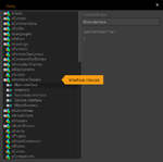
If you would like to add more interface classes, or rename them, you could do this using the "Explorer" tool:
- Open the "Explorer" window by pressing "Ctrl+E" or via the menu.
- Find "eInterfaceClasses" and click [+] to open the list.
- Right-click on "eInterfaceClasses" and choose "Create 'Interface class'" to add a new class.
- Select a class and change its name in the upper right text box.
- Right-click an interface class and click "Delete" to delete a class.
Some changes may only be visible after closing (and re-opening) the "Explorer".
Interface properties
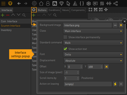
Open the interface properties window via the small cog icon next to the "Buttons" tab (see image).
- Background image: Set the background image for the interface. It is not required to have one though. If you're heading for the two-button solution, for example (type C in the first image on this page), you wouldn't need a visible command interface.
- Class: Assign an interface class.
- Show interface permanently: Check this option to prevent hiding of the interface. It would be visible even during cutscenes.
- Standard command: One of your game commands is always set active during the game. Define one of them as the standard command which will become the active command whenever no other command is set.
- Show action text: This enables the display of action text within the interface. You need to have a font defined (see next property) and a text area added to the interface to make it work. If you show the action text on the interface, you would usually want to disable action text display in the game properties to prevent duplicate action text.
- Font: Choose a font for the action text. Only applicable if "Show action text" is enabled.
- Displacement: Select where to display the interface. If you choose "Top", "Bottom", "Left", or "Right", the interface will be placed next to the scene, meaning the scene has to be smaller than the game's resolution (unless it's intended to scroll); otherwise the scene will be shifted out of the screen. Use the "Absolute" option to place the interface at a certain position on the scene. The position itself is defined in "Offset". Choose "Current cursor position" to display the interface at the current position of the cursor (like for a verb coin). Use the "Offset" setting to define the offset from the cursor position.
- Offset: Only applicable if "Displacement" is set to "Absolute" or "Current cursor position". Defines the absolute interface position (measured from the top left corner of the screen) or the offset from the cursor position (with the top left corner of the interface being at the cursor position at [0,0] and positive values shifting the interface top left), respectively. Note that an interface at cursor position will always be placed entirely on-screen. Its offset will be adjusted automatically, if the cursor is too close to the edge of the screen.
- Size of image (pixel): Only applicable if "Displacement" is set to "Top", "Bottom", "Left", or "Right". This setting lets you overlap scene and interface by a certain amount of pixels. It allows for irregular shaped or semi-transparent interface edges where the underlying scene has to show through. You have to enter a value between 0 and the height/width of the interface. An example: With a game resolution of 640x480px and a "bottom" placed interface of 640x170px, your scene graphics need to be 640x310px, so both interface and scene fit next to each other. Now if the interface had a "rough" edge (some 20px high zig-zag instead of a straight line), you would need to overlap interface and scene by those 20 pixels: create the scene graphics at 640x330px and set "Size of image" for the interface to 150px despite the graphic being 170px high. It is usually easier to use the "Abolute" positioning option though.
- Scroll items by _ position(s): This setting is only applicable, if the interface contains an inventory featuring item placeholders and the respective scroll buttons. It defines the amount of positions the inventory will scroll when clicking one of the scroll buttons.
- Action on leaving: Set up an action which will get executed once the cursor leaves the interface area. This is usually used to hide an interface, which is only temporarily shown (verb coin, inventory etc.).
The interface viewport
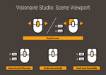
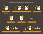
As soon as you have linked a background image in the interface properties, it will show up in the viewport, where you can add buttons and draw areas. Please refer to the scenes and objects page on how to navigate the viewport. Likewise, editing areas on interfaces works basically the same way as editing way borders on scenes.
Interface size/area
The size of an interface is defined by its background image. If you set up a command interface without any visible buttons, just do not add a background image. If you plan on a verb-coin-like interface with visible buttons but without a background image, add a transparent image at the dimensions you need for placing your buttons (it might actually be easier to add a non-transparent image first, arrange your buttons on it and then replace the background image with the transparent one – so that you can see what you are doing).
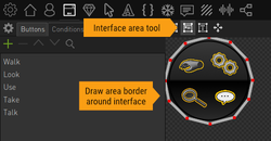
By default, Visionaire handles all interfaces as rectangles. This is important, if you have an "Action on leaving" defined in the interface properties. This action will get executed once the cursor leaves the rectangular bounding box of the background image of the interface – even if your interface has a different shape (e. g. a circle). The transparent areas of the image are not automatically detected. You can change this default behaviour though: In the interface viewport activate the second area tool to draw a custom interface area polygon around the shape of your (non-rectangular) interface (see image).
Action text on the interface
Visionaire Studio offers several options to place the action text in your game. In the game properties you can choose between display at the cursor, display at a defined position, or not to display action text at all. A fourth option is to place it on your interface (you would then usually disable it in the game properties to prevent showing it twice).
Be sure to have the "Show action text" setting checked and a font defined in the interface properties. Activate the [ T ] area tool in the viewport to draw a rectangle shape on your interface (see image). The action text area is not bound to a button object.
Buttons
Objects you place on an interface are called Buttons in Visionaire Studio, even if not all of them have the function of a button. They are basically the same as objects on a scene, despite their name. Interface buttons have their own special options and functions though.
Similar to scene objects, you can add the following things to an interface button:
- an object area (interaction hotspot)
- actions that get executed when the user interacts with the button
- two images
- animations
- components
You can add as many buttons as you like to an interface on the "Buttons" tab. The order of buttons in the list corresponds to the order in which the player draws the images/animations – meaning it is of importance, if you have buttons overlap each other. The order of drawing is from the bottom to the top of the list.
On the "Button properties" panel you can define the Button type. There are 6 types of buttons, each of them elaborately described below:
- Command button
- Command group
- Action area
- Scroll items up/backward
- Scroll items down/forward
- Placeholder for items
Interacting with the button
With the exception of command groups each button type may have a hotspot – called object area in Visionaire Studio – added to it. The object area itself is invisible in the game but gets recognized by the cursor. Interacting with the object area (clicking, hovering etc.) may execute an action defined on the "Actions" tab of the button below the viewport.
With the button selected in the buttons list, activate the object area tool (rectangle icon) above the viewport and start drawing the object area polygon (see image). If the area tool is activated but no object is selected, all object areas will be shown in the viewport, and you can select an object by clicking on its object area.
Button images and animations
With the exception of command groups you may add images and/or animations to buttons. Please refer to the scenes and objects page on how to do this.
Unlike for scene objects, it is possible to not only add one but two images to a button – one called "active", one called "inactive". They have their own tabs below the viewport (see image in previous chapter). The reason for having two images is that buttons often have a second "hover" state. The "hover" state does not show automatically though. By default, the inactive image is shown; use the Set active/inactive image action part to switch images.
Disable/Enable buttons
You can easily disable/enable a button by changing a linked condition or value. See the Conditions and Values page for more.
Command buttons
Each command button is first and foremost the definition of a command (verb) which is available to the user when playing the game (e. g. "Look at" or "Use"). When you add actions to objects or other elements of your project, you can assign these commands in the execution type definition of the action, meaning the action will get executed, if the user applies the respective command on the object.
At the same time, a command button can also be a proper "button", meaning it may have an object area (hotspot) and some graphical representation within the interface. Clicking this button in the game is one way to set the respective command active – the other one being through the "Set command" action part.
You can add as many commands to your game as you like. There is always one command active during the game.
Standard command
Define one of your commands as the "Standard command" in the interface properties. It will become the active command whenever no other command is set. In a SCUMM-type or verb coin interface you would probably have a "Walk to" command as your standard command and barely use it as execution type for an action, except for exits to other scenes, for example. It would be for walking around only – the user would have to actively choose the command he wanted to use on an object, from the interface. In a two-button interface your standard command would probably be the "Use" command, active for instant use with the left mouse button, while you would have to set up a global right mouse button action containing the "Set command" action part to activate the second available command (usually "Look at").
In the game properties you can define if you want the standard command to become active atomatically after performing an action.
Command properties
Set the properties of your command buttons (see image):
- The Name of the command will become part of the action text; leave it empty, if you don't want that (e. g. "Use Key" vs. "Key" when hovering over the key object with the "Use" command being active).
- Each command has its own Cursor assigned to it which gets used whenever that command is active. That's why you need at least one command in your game – otherwise you wouldn't have a visible cursor (unless you're creating something by using menu type scenes only). It's up to you, if you want to assign individual cursors to each command or maybe use the same cursor for all of them.
- Command can be used on: Not every combination of commands makes sense. A "Talk to" command is usually not used on objects but only on characters. That's why you can restrict the possible applications of each command.
- Most commands are "Normal commands". You can turn a command into a "Combined command" though, by setting its Command type accordingly. A combined command is able to combine an inventory item with a scene object, a character, or with another item. That's where the "Items can be dragged with this command" setting and the Conjunction word also come into play. See the combined commands chapter below for more on this topic. The "'Give' command"´is a special kind of combined command as it automatically removes the item from the inventory of the playable character and adds it to the other character involved in this action (this only works on characters of course).
Combined commands vs. dragging items
As said above, combined commands are able to combine an inventory item with a scene object, a character, or with another item. There are basically two ways of combining items with other elements in Visionaire Studio:
- the "sentence" solution, where the user clicks on the (combined) command, then on the item, then on the second object, while a sentence is being assembled in the action text (e. g. "Use" + "Key" + "with" + "Door")
- the "dragging" solution, where the user clicks on the item and "drags" it out of the inventory, meaning the item temporarily becomes the cursor which is then dropped onto the second object
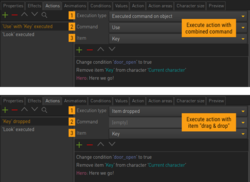
The first solution is known from SCUMM-type interfaces which usually rely on action text telling the user what's happening. If you're heading for this solution, you have to set the Command type of your "Use" command (don't forget to set its name) to "Combined command". Leave the "Items can be dragged with this command" setting unchecked and set "with" as the Conjunction word. If you now want to combine an item ("Key") with an object ("Door"), you have to add an action to the object with [1] Execution type: "Executed command on object"; [2] Command: "Use"; [3] Item: "Key" (see image).
For the "dragging" solution you only work with a "Normal command" instead of with a "Combined command". Depending on your interface setup you would either have a dedicated "Use" command for dragging items or simply utilize the standard command (could be the "Walk to") to be able to drag items anytime. Check the "Items can be dragged with this command" setting of the respective command as well as "Allow dragging of items from inventory" in the game properties. If you now want to combine an item ("Key") with an object ("Door"), you have to add an action to the object with [1] Execution type: "Item dropped"; [2] Command: disabled; [3] Item: "Key" (see image).
It is possible (although unusual) to make use of both the dragging and the action text sentence at the same time. Set everything up for the dragging solution, then set the command type to "Combined command" to be able to add a conjunction word. You can set the command type back to "Normal command" afterwards even if the conjunction word text field gets disabled again. The Visionaire player will use the word nevertheless.
Command groups
"Command group" buttons aren't buttons at all. They are virtual groups of command buttons. Command groups allow you to to assign the execution of an action to multiple commands at once.
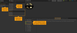
Create a new "Command group" button and choose the command buttons you wish to add to the group by selecting them on the "Command group" tab (see image). You can group commands from different interfaces; and it doesn't matter to which interface the group itself is added. No other settings are available for command groups.
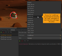
Command groups are usually used to group similar commands from different interfaces. Let's say you have two different interfaces for your playable character: one for mouse control, one for touch control. When starting the game, the user should have the option to choose which interface he would like to use, depending on his device. That means you basically end up with two "Look" commands, two "Use" commands, two "Talk" commands etc. which are all supposed to trigger the exact same actions. But it would be tedious to add all game actions twice. That's where the command groups come into play. Add a "LookGroup", a "UseGroup", a "TalkGroup" etc. on one of the interfaces to combine each two corresponding commands. Command groups are available as commands when defining the execution type of your actions, allowing you to select a command group as the trigger instead of one of the regular commands (see image). Each command that's part of the selected group will execute the action.
Another use case are multiple playable characters, each with their own interface, but able to do the same things for most parts of the game. Add command groups and use them in all actions where it doesn't matter which of the characters performs them.
Inventories
The term "inventory" has two different meanings: it can refer to the collection of items a character owns, or to the interface displaying those items. Items are always assigned to a character, not to an interface. For example: if you have multiple playable characters who share the same inventory interface, and you switch characters during the game, the items showing in the interface will also change. So the interface only provides a display area for the characters' items.
It is up to you, how many items you want to show on your inventory interface. Add as many interface buttons and choose "Placeholder for items" as their Button type. Then activate the object area tool (rectangle icon) and draw the placeholder areas as described above for the button hotspots. That's basically it – the display of items inside the hotspots is done atomatically by the engine.
The number of items a character can own is unlimited. So you usually need to add scroll buttons to your inventory. Add two interface buttons and choose "Scroll items up/backward" and "Scroll items down/forward", respectively, as their Button type. Add hotspots and optionally one or two images for each button. The scrolling function is automatically added by choosing the right button type, so you don't need to add an action for that. The amount of positions the inventory will scroll when clicking one of the scroll buttons is defined in the interface properties.
Action areas
"Action areas" on an interface are not to be confused with "action areas" on a scene. On an interface they are just regular objects/buttons without any special feature. You can use them to create custom buttons or add images or animations to your interface.
Components
Components can be viewed as object extensions. They add additional features to the respective objects.
Interface components
On the "Components" tab of the interface you can add custom behaviours. Click the [+] icon to get a list of the interface behaviours you created before and select one.
Custom behaviours override the default behaviours of Visionaire, thus allowing for advanced modification and customization of the whole system. This even enables you to develop other types of games than point-and-click adventures. Behaviours are created using the Ilios scripting language.
Button components
Click the [+] icon on the "Components" tab of a button to add a component to this button. You'll get a list of available components split into four groups: "Internal Components" are directly built into the engine. The "Shaders", "Particle Containers", and "Behaviours" groups are empty by default as they only contain components you added to the project before (see image).
Internal Components
- Transform: This component lets you displace, scale, and rotate the respective button. However, only images and animations attached to that button are affected, the object area is not. Note that the transform center is the top left corner of the interface, and rotation is defined in radian instead of degrees. There is no convenient way to change these settings at runtime, although you can always transform objects/buttons through a script. If you create images and animations at the right dimensions and orientation in the first place – which is recommended – you'll probably rarely use this component.
- Text: See the Text page for more on the text component.
- Movie: This component lets you add movies to your interface. Unlike videos started through the Play video action part, which always take up the entire screen, component videos are added to the interface just like animations. Disabling the button will hide the video, too; enabling the button will display and restart the video (from the beginning). There is no convenient way to stop/pause/continue a video at runtime.
The "Particle System", "Shader", and "Behaviour" components are also listed in the respective groups below the "Internal Components" group (see below).
Shaders
You can assign a shader to an interface button to modify its visual appearance. See the Shaders page for more on this.
Particle Containers
You can assign a particle system to an interface button. That system will be visible as long as the respective button is visible. See the Particle System page for more on how to set up particle systems.
Behaviours
Just like for interface components (see above) you can assign a button behaviour to an interface button.

