Difference between revisions of "Characters Tab"
m |
|||
| (14 intermediate revisions by the same user not shown) | |||
| Line 1: | Line 1: | ||
<div id="#top"></div> | <div id="#top"></div> | ||
| − | {| class=" | + | {| class="ts" |
|- | |- | ||
| <b>Characters</b>: This is where you can create your characters, outfits, & animations etc... || [[File:character25.png|right|25px|link=]] | | <b>Characters</b>: This is where you can create your characters, outfits, & animations etc... || [[File:character25.png|right|25px|link=]] | ||
| Line 10: | Line 10: | ||
| − | {| class=" | + | {| class="ts" |
|- valign="top" | |- valign="top" | ||
| '''Create new entry''': add a new animation to one of the character animation sections. || [[File:add.png|right|link=]] | | '''Create new entry''': add a new animation to one of the character animation sections. || [[File:add.png|right|link=]] | ||
| Line 32: | Line 32: | ||
| − | {| class=" | + | {| class="ts" |
|- valign="top" | |- valign="top" | ||
| '''Edit animation''': this shows the animation preview screen, where you can preview, or edit the animation. || [[File:anim_editor.png|right|link=]] | | '''Edit animation''': this shows the animation preview screen, where you can preview, or edit the animation. || [[File:anim_editor.png|right|link=]] | ||
| Line 74: | Line 74: | ||
| − | {| class=" | + | {| class="ts" |
|- | |- | ||
| '''Animation frames''': the black <span class="large">•</span> signifies the active frame. || [[File:anim_nframe_block.png|right|link=]] | | '''Animation frames''': the black <span class="large">•</span> signifies the active frame. || [[File:anim_nframe_block.png|right|link=]] | ||
| Line 84: | Line 84: | ||
=== Properties === | === Properties === | ||
| − | {| class=" | + | {| class="ts" |
|- style="vertical-align:top" | |- style="vertical-align:top" | ||
| '''Pauses [msec]''': set the global pause value between animation frames in milliseconds; in other words: it determines how long each frame will be shown for. || rowspan="8" | [[File:char_outfits_tab_properties.png|50px|right]] | | '''Pauses [msec]''': set the global pause value between animation frames in milliseconds; in other words: it determines how long each frame will be shown for. || rowspan="8" | [[File:char_outfits_tab_properties.png|50px|right]] | ||
| Line 107: | Line 107: | ||
Both ''add frame'' & ''edit frame'' use the '''Load graphic'' window; in the case of ''edit frame'' the animation frame preview will already be shown as the link to the graphic is already set & all settings, actions etc, will be as you left them after importing a new frame, or editing the selected frame. | Both ''add frame'' & ''edit frame'' use the '''Load graphic'' window; in the case of ''edit frame'' the animation frame preview will already be shown as the link to the graphic is already set & all settings, actions etc, will be as you left them after importing a new frame, or editing the selected frame. | ||
| − | {| class=" | + | {| class="ts" |
|- style="vertical-align:top" | |- style="vertical-align:top" | ||
| '''Transparency ['' '''none'' ''']''': don't use use transparency for current animation frame; ok for solid images that do not contain any transparent background parts. || rowspan="9" align="right" | | | '''Transparency ['' '''none'' ''']''': don't use use transparency for current animation frame; ok for solid images that do not contain any transparent background parts. || rowspan="9" align="right" | | ||
| Line 137: | Line 137: | ||
The '''Animation Studio''' (aka the ''harmonizer'') is used for making sure your character animations are all correctly aligned. It allows you to compare the currently selected animation with other animation by selecting them from a drop down menu. You can also adjust the character center with this tool. | The '''Animation Studio''' (aka the ''harmonizer'') is used for making sure your character animations are all correctly aligned. It allows you to compare the currently selected animation with other animation by selecting them from a drop down menu. You can also adjust the character center with this tool. | ||
| − | {| class=" | + | {| class="ts" |
|- style="vertical-align:top" | |- style="vertical-align:top" | ||
| '''Current animation''': adjust the current frame, play/stop the animation, or update the character center for the current animation. || rowspan="7" align="right" | | | '''Current animation''': adjust the current frame, play/stop the animation, or update the character center for the current animation. || rowspan="7" align="right" | | ||
| Line 161: | Line 161: | ||
| − | {| class=" | + | {| class="ts" |
|- style="vertical-align:top" | |- style="vertical-align:top" | ||
| '''Walking speed''': set the default walking speed of the selected character outfit. (applicable for both 2d & 3d characters) | | '''Walking speed''': set the default walking speed of the selected character outfit. (applicable for both 2d & 3d characters) | ||
| Line 169: | Line 169: | ||
| − | {| class=" | + | {| class="ts" |
| '''3D model file''': load in a 3D character or object file here. | | '''3D model file''': load in a 3D character or object file here. | ||
|- | |- | ||
| Line 218: | Line 218: | ||
| − | + | {| class="ts" | |
| − | {| class=" | ||
|- style="vertical-align:top" | |- style="vertical-align:top" | ||
| '''Name''': define the ''diplayed action name'' of the character, for each available game language that you have defined. | | '''Name''': define the ''diplayed action name'' of the character, for each available game language that you have defined. | ||
| Line 237: | Line 236: | ||
| − | + | {| class="ts" | |
| − | {| class=" | ||
|- style="vertical-align:top" | |- style="vertical-align:top" | ||
| '''Font''': defines the font used for displayed text of the character. | | '''Font''': defines the font used for displayed text of the character. | ||
| Line 253: | Line 251: | ||
== Actions == | == Actions == | ||
| − | See [[ | + | See ''[[Action_System|actions]]'' for more details. |
| + | |||
== Interfaces == | == Interfaces == | ||
| − | This is where you assign which interfaces will be used by the character. Selected | + | This is where you assign which interfaces will be used by the character. Selected interfaces will be visible from game launch (in playable scenes), but they can be hidden via the '''At begin start following action''' in the ''[[Game_Tab#Game_Properties|game tab]]'' with the '''show/hide interface''' action part. |
[[File:char_interfaces.png|400px]] | [[File:char_interfaces.png|400px]] | ||
| + | |||
| + | |||
| + | == Comment sets == | ||
| + | Comment sets are what the current character will randomly select from when the player tries to execute an invalid command on a scene object, character or item. See ''[[Displayed_Text|displayed text]]'' for more information about displayed texts, types & time values. | ||
| + | |||
| + | |||
| + | [[File:char_comment-sets.png|400px]] | ||
| + | |||
| + | |||
| + | == Dialogs == | ||
| + | Dialogs are conversations that take place between the current character & the character whose dialog you start. Personally I do not like to use the dialog system myself because I do not find the current system very flexible in terms of what could potentially be done during dialog conversations, such as: controlling the character animations, executing various action parts, or multi-way conversations between a group of people. | ||
| + | |||
| + | |||
| + | [[File:char_dialogs.png|400px]] | ||
| + | |||
| + | |||
| + | {| class="ts" | ||
| + | | '''Text of dialog part''': this is what will be displayed for the dialog option text. | ||
| + | |- | ||
| + | | '''Answer to dialog part''': this is what will be said by the npc after the ''text of dialog part''; leave blank to prevent npc from replying. | ||
| + | |- | ||
| + | | '''Alternate text for dialog part''': if this is activated, then the text included in the text box below will be spoken instead of the text inside of the ''text of dialog part'' text box. | ||
| + | |} | ||
| + | |||
| + | |||
| + | {| class="ts" | ||
| + | | '''Only show dialog part if condition is [''' ''<span class="green">true</span> ''''']''': the selected dialog part will only be shown if the linked condition is <span class="green">true</span>. | ||
| + | |- | ||
| + | | '''Only show dialog part if condition is [''' ''<span class="red">false</span> ''''']''': the selected dialog part will only be shown if the linked condition is <span class="red">false</span>. | ||
| + | |- | ||
| + | | '''Execute action''': any action parts listed here will be executed after the selected dialog part has finished. | ||
| + | |- | ||
| + | | '''Call action''': the linked action will be played after the selected dialog part has finished. | ||
| + | |- | ||
| + | | '''Stay at same dialog level''': the selected dialog level will stay at current dialog level after the selected dialog part has finished; unless the selected dialog contains a dialog branch. | ||
| + | |- | ||
| + | | '''Switch to previous dialog level''': the current dialog level will go back up by one (only if there is a level above). | ||
| + | |- | ||
| + | | '''Exit dialog afterwards''': this will stop & close the dialog session after the current dialog has finished. | ||
| + | |- | ||
| + | | '''Delete dialog part entry''': this will permanently delete the selected dialog part after the selected dialog has finished. | ||
| + | |} | ||
| + | |||
| + | |||
| + | == Dialog area == | ||
| + | [[File:char_dialog_area.png|400px]] | ||
| + | |||
| + | |||
| + | {| class="ts" | ||
| + | | '''Active scroll arrow''': these are the images used to represent the active (mouse over) scroll arrow; arrow only shown when available. | ||
| + | |- | ||
| + | | '''Active scroll arrow [''' ''up'' ''']''': this is the image used to represent the active scroll arrow for scrolling upwards (backwards). | ||
| + | |- | ||
| + | | '''Active scroll arrow [''' ''down'' ''']''': this is the image used to represent the active scroll arrow for scrolling downwards (forward). | ||
| + | |- | ||
| + | | '''Inactive scroll arrow''': these are the images used to represent the inactive (mouse out) scroll arrow; arrow only shown when available. | ||
| + | |- | ||
| + | | '''Inactive scroll arrow [''' ''up'' ''']''': this is the image used to represent the inactive scroll arrow for scrolling upwards (backwards). | ||
| + | |- | ||
| + | | '''Inactive scroll arrow [''' ''down'' ''']''': this is the image used to represent the inactive scroll arrow for scrolling downwards (forward). | ||
| + | |- | ||
| + | | '''Vertical space [''' ''pixel'' ''']''': this determines the amount of space (in pixels) between each dialog option. | ||
| + | |} | ||
| + | |||
| + | |||
| + | == Conditions == | ||
| + | See ''[[Conditions_and_Values#Conditions|conditions & values]]'' for more details. | ||
| + | |||
| + | |||
| + | == Values == | ||
| + | See ''[[Conditions_and_Values#Values|conditions & values]]'' for more details.{{toc}} | ||
Latest revision as of 21:59, 23 September 2016
| Characters: This is where you can create your characters, outfits, & animations etc... | |
Outfits
| Create new entry: add a new animation to one of the character animation sections. | |
| Remove selected entry: delete the selected animation. | |
| Rename selected entry: rename the selected animation. | |
| Duplicate selected entry: create a duplicate of the selected animation. | |
| Copy selected entry to clipboard: copy selected animation to memory. | |
| Paste selected entry from clipboard: paste currently stored animation from memory; must be an animation. | |
| Copy selected entry to clipboard: copy selected animation to memory. | |
| Move selected entry up: shift the selected animation up the list by 1 position. | |
| Move selected entry down: shift the selected animation down the list by 1 position. | |
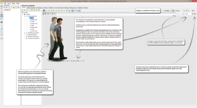
| Edit animation: this shows the animation preview screen, where you can preview, or edit the animation. | |
| Properties: allows you to edit loop amount, direction, frame delay value, & various playback settings, such as: play forwards, reverse, or random frame selection. | |
| First frame: jump back to the first frame. | |
| Previous frame: jump back 1 frame. | |
| Play animation: allows you to preview the animation. | |
| Next frame: jump forward 1 frame. | |
| Last frame: jump forward to the last frame. | |
| Add frame: opens load graphic box, import image, & edit settings for a single frame | |
| Delete frame: delete the currently selected frame. | |
| Edit frame: opens load graphic box, replace current image, edit various settings, & create custom actions, for the currently selected frame. | |
| Load frame sequence: allows you to batch import animation frame images; images must contain same name with a prefix index number like so: walk_west_01, walk_west_02, ..., walk_west_10, etc... | |
| Onion effect: allows you to display a semi-transparent version, of whichever animation frame you assign the red • dot to. | |
| Set animation center: controls the current position of the character, & is used for detecting when character enters an action area, or reaches a destination; should be set somewhere near the characters feet, in the center. | |
| Animation studio: opens the animation studio window, which allows you to harmonize current character animation center, to another character animation; useful for checking if character animations are correctly aligned. | |
| Set character movement for walk animation: control the movement/position, of the character between frames, preview what character will look like walking across the screen; only available for walk animations. | |
| Zoom in: zoom in to the character animation; max zoom of 400%. | |
| ZoomOriginalButton: reset zoom back to actual character size. | |
| Zoom out: zoom in to the character animation; min zoom of 25%. | |
| Initialize character movement based on character speed of outfit: automatically create movement points between frames based on character speed, set in outfit properties tab; only available when set character movement is enabled. | |
| Animation frames: the black • signifies the active frame. | |
| Animation frames with onion effect enabled: the red • signifies the active semi-transparent onion frame. | |
Properties
| Pauses [msec]: set the global pause value between animation frames in milliseconds; in other words: it determines how long each frame will be shown for. | |
| Play forwards: loops through the animation forwards; the way it was intended to be played. | |
| Play backwards: loops through the animation in reverse; for people who want to travel backwards through time, or for people who are called Tom. | |
| Play in random order: this creates a random pause (between 5 & 20 seconds) between animation loops; useful for randomly triggering environmental scene animations. | |
| Set pause for each frame: this allows you to create individual pause values for each animation frame; overrides the pauses [msec] value above. | |
| Direction of animation: allows you to set the alignment of the currently selected animation. | |
| Start action after animation has finished: allows you link to a previously created action, which will be executed after the animation has finished playing; does not work for animations in the walk, standing, or talking animation sections. | |
| Mirror following animation: mirrors the linked animation, so you don't have to create individual animations for each direction; this will cause issues with Lua scripts that require access to character animations, or specific character animation frames. |
Add/Edit Frame
Both add frame & edit frame use the 'Load graphic window; in the case of edit frame the animation frame preview will already be shown as the link to the graphic is already set & all settings, actions etc, will be as you left them after importing a new frame, or editing the selected frame.
| Transparency [ none ]: don't use use transparency for current animation frame; ok for solid images that do not contain any transparent background parts. | |
| Transparency [ alpha channel ]: uses images alpha channel for transparency; if available. | |
| Transparency [ color ]: allows you to set the background color mask; old school masking method in which the all parts containing the specified color will be ignored. | |
| Sound file: allows you to add a single sound file that will be triggered when the animation frame is shown. | |
| Action: allows you to create actions via the animation frame action window, which will be executed when the animation frame is shown. | |
| Volume: allows you to set the volume level of the sound file; providing you have added a sound file. | |
| Balance: allows you offset the balance (left/right) of the sound file; providing you have added a sound file. | |
| OK: apply the changes & close the window. | |
| Cancel: undo the changes & close the window. |
Animation Studio (harmonizer)
The Animation Studio (aka the harmonizer) is used for making sure your character animations are all correctly aligned. It allows you to compare the currently selected animation with other animation by selecting them from a drop down menu. You can also adjust the character center with this tool.
| Current animation: adjust the current frame, play/stop the animation, or update the character center for the current animation. | |
| Adjust to: select & display another character animation to compare the current animation to. | |
| Selected animation: adjust the current frame, or play/stop the animation for the selected animation. | |
| Visibility [ Current animation ]: adjust the opacity level of the current animation. | |
| Visibility [ Selected animation ]: adjust the opacity level of the selected animation. | |
| OK: apply current changes & close the window. | |
| Cancel: undo current changes & close the window. |
Outfit Properties
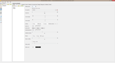
| Walking speed: set the default walking speed of the selected character outfit. (applicable for both 2d & 3d characters) |
| Sliding walk animation: if true then the character will slide between frames while walking, else the characters position will only be updated on each new frame. (applicable for both 2d & 3d characters) |
| 3D model file: load in a 3D character or object file here. |
| Scale factor: define the default size [%] of the linked 3D model. |
| Camera height: height of the cameras focal point; relative to the height of the character. |
| Camera angle: tilt angle of the camera; -90 = bottom upwards, 0 = center, +90 = top downwards. |
| Lighting: determines how the character is shaded. |
| Lighting [ none ]: displays the character without shading. |
| Lighting [ realistic ]: uses realistic diffuse shading to display the character. |
| Lighting [ cartoon ]: display the character with cartoon-like shading & hard intensity transitions. |
| Lighting [ intensity nuances ]: defines the amount of different intensity nuances which will be used for cartoon-like shading. |
| Light color: defines the color of the directional light source; has both RGB & HSV color options. |
| Light position: defines the position of the light source. |
| Ambient light color: defines the ambient light color & controls the basic brightness of the character; has both RGB & HSV color options. |
| Ambient occlusion: defines the self-shadowing amount of the character. |
| Shadow: determines the shadow type of the character. |
| Shadow [ none ]: character has no shadow. |
| Shadow [ simple ]: the shadow always looks the same & is just a simple spot. |
| Shadow [ projected ]: the shadow is dynamically rendered; based on the light settings & the 3D character model. |
| Shadow visibility: defines the opacity of the shadow. |
| Display outlines: determines if an outline should be drawn around the character. |
| Outline width: defines the width of the character outline. |
| Outline color: defines the color of the character outline; has both RGB & HSV color options. |
Properties
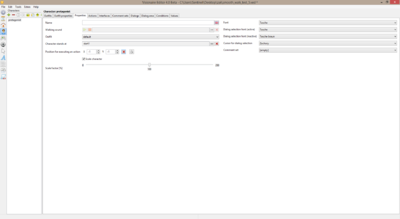
| Name: define the diplayed action name of the character, for each available game language that you have defined. |
| Walking sound: define an audio file to be used for character footstep sounds; you can also preview/stop the sound. |
| Outfit: define the initial outfit that the character will use. |
| Character stands at: define the initial scene & character start point by linking the character to a scene object. |
| Position for executing an action: defines the position of where the current character will walk to when executing an action on this character; should only be used for NPC characters, that will remain static in a specific scene. |
| Scale character: if true then the character will be scaled based on the scale factor of the way system, else the character will be displayed at it's original size. |
| Scale factor [ % ]: defines the default scale value of the character; this will also be taken into account when the character is being scaled by the way system. |
| Font: defines the font used for displayed text of the character. |
| Dialog selection font (active): defines the active font for dialog selection; the dialog option font will be replaced by this when the mouse cursor is over it. |
| Dialog selection font (inactive): defines the inactive font for dialog selection; this is the default font that will be displayed for dialog options. |
| Cursor for dialog selection: defines the cursor that will be shown when mouse cursor is over a dialog option. |
| Comment set: defines the default comment set of the character; comment sets are random displayed texts that are used when character executes an invalid action on an item, scene object, or character. |
Actions
See actions for more details.
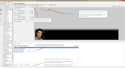
Interfaces
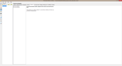
This is where you assign which interfaces will be used by the character. Selected interfaces will be visible from game launch (in playable scenes), but they can be hidden via the At begin start following action in the game tab with the show/hide interface action part.
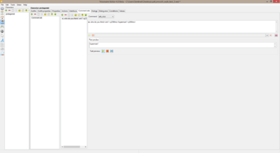
Comment sets
Comment sets are what the current character will randomly select from when the player tries to execute an invalid command on a scene object, character or item. See displayed text for more information about displayed texts, types & time values.
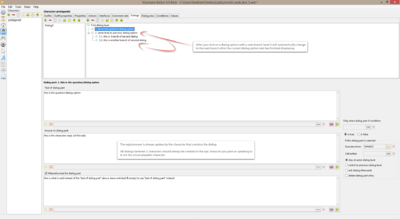
Dialogs
Dialogs are conversations that take place between the current character & the character whose dialog you start. Personally I do not like to use the dialog system myself because I do not find the current system very flexible in terms of what could potentially be done during dialog conversations, such as: controlling the character animations, executing various action parts, or multi-way conversations between a group of people.
| Text of dialog part: this is what will be displayed for the dialog option text. |
| Answer to dialog part: this is what will be said by the npc after the text of dialog part; leave blank to prevent npc from replying. |
| Alternate text for dialog part: if this is activated, then the text included in the text box below will be spoken instead of the text inside of the text of dialog part text box. |
| Only show dialog part if condition is [ true ]: the selected dialog part will only be shown if the linked condition is true. |
| Only show dialog part if condition is [ false ]: the selected dialog part will only be shown if the linked condition is false. |
| Execute action: any action parts listed here will be executed after the selected dialog part has finished. |
| Call action: the linked action will be played after the selected dialog part has finished. |
| Stay at same dialog level: the selected dialog level will stay at current dialog level after the selected dialog part has finished; unless the selected dialog contains a dialog branch. |
| Switch to previous dialog level: the current dialog level will go back up by one (only if there is a level above). |
| Exit dialog afterwards: this will stop & close the dialog session after the current dialog has finished. |
| Delete dialog part entry: this will permanently delete the selected dialog part after the selected dialog has finished. |
Dialog area
| Active scroll arrow: these are the images used to represent the active (mouse over) scroll arrow; arrow only shown when available. |
| Active scroll arrow [ up ]: this is the image used to represent the active scroll arrow for scrolling upwards (backwards). |
| Active scroll arrow [ down ]: this is the image used to represent the active scroll arrow for scrolling downwards (forward). |
| Inactive scroll arrow: these are the images used to represent the inactive (mouse out) scroll arrow; arrow only shown when available. |
| Inactive scroll arrow [ up ]: this is the image used to represent the inactive scroll arrow for scrolling upwards (backwards). |
| Inactive scroll arrow [ down ]: this is the image used to represent the inactive scroll arrow for scrolling downwards (forward). |
| Vertical space [ pixel ]: this determines the amount of space (in pixels) between each dialog option. |
Conditions
See conditions & values for more details.
Values
See conditions & values for more details.
